Many companies are missing out on the opportunity to be remembered through their website experience. With our attention spans being stretched on a daily basis, companies are having to work harder to make their work stand out and to connect with audiences. It's important to be remembered, otherwise what's the point?
“What websites should we look at for inspiration?” is probably one of the most difficult questions we receive. Firstly, because most corporate websites are so similar and formulaic that few stand out and secondly, because it's all too common for businesses to be happy enough following what's been done before.
Inspiration, or the right answer won't always come from looking elsewhere, you need to look much harder inwardly to find something both genuine, different and memorable.
Here's five ideas to help make your website experience live in the mind a little longer:
1. Define your place in the world
Purpose has been slowly moving up the corporate agenda in recent years. Your place in the world and what you contribute can inspire and align with individual values, building rapport and longer lasting personal connections.
Surprisingly, few companies go beyond explicitly stating what they do or their purpose, while others don't appear to have one. Even fewer companies express what purpose really means for them in practice or present it in a compelling way.
When you look at successful businesses, it's clear that they know why they exist and what makes them unique and more desirable than their peers. Once you nail that you can have fun, amplify and find every possible way of building on what you have each time, providing the licence to create more meaningful work.

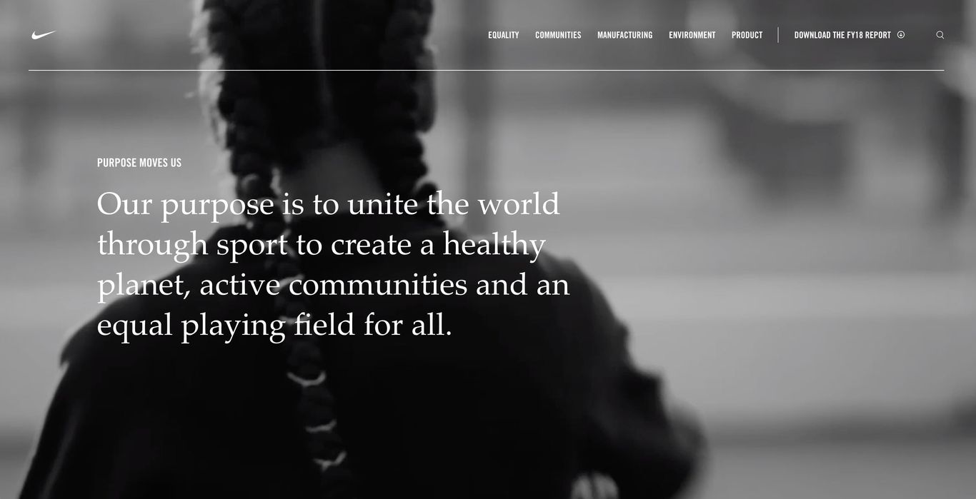
Nike have a dedicated website for their purpose with inspiring evidence and campaigns. Hard to find, not completely seamless, but it's memorable.

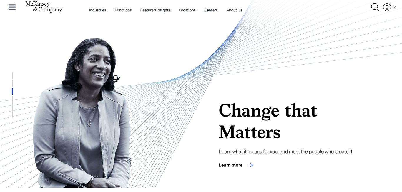
McKinsey Company's rebrand in 2019 was ultimately about representing change and anticipating the future. Everything from the logo to the nature of the content relates back to that idea. It's all working together and is distinctive enough to stick.
2. Find your personality
A purpose gives you something to work with and it's a great start, but how can you express it with authenticity? One way to begin is to define your archetype and use your personality to guide you. If your business is a person, who is it and what are they like?
Few companies lean on the personal qualities that makes them what they are. Most play it very safe and melt into the corporate quagmire - it's Pantone Classic blue by the way.
So, decide if you are a straight talker like Churchill, on a mission like Greta or just happy being Mr Nice like Tom Hanks. Then express those traits with conviction, consistency and always be true to yourselves.
Emotion is closely connected here. It's a big subject in itself and another missed opportunity. We know from research as well as personal experience that some of our clearest memories are from the times when our emotions were running high.
Although we're not suggesting a website should try and compete with your first kiss or the shower scene in Psycho, every business should look for their moment to create something to remember them by. Maybe just doing something unexpected could be enough, or just being brutally honest could be refreshing, different and stick with your audience.
It's well worth fighting to reduce here rather than add, it's easy to get carried away trying to reflect everyone and everything. Keep it simple, “Less but better” as Dieter rightly said.
3. Align or throw in the towel
Large organisations, the complex beasts that they are, will have many voices to bring on the journey. Getting your colleagues behind a position or an idea could be the hardest task but also one of the most critical. Instead of being a collective force, they potentially could become the anchors that keep you stuck in the quagmire.
You can often tell when a company is aligned, everything looks right, it comes together quickly and messages strike you with equal power at all levels. Websites often fail when teams break away and build elsewhere or run with their own language or visual territories. Be at one to be most effective and memorable.
Easy to grasp concepts will help you stick together and your ideas will last in the mind a lot longer. The best ads in the world prove that simple ideas work, why should it be any different for a website experience? M&C gave us Brutal Simplicity of Thought – originally a training manual for employees, now a bible found in most agencies.
4. Decide where to focus
There are certain sections of corporate websites that need to follow a formula, it's what people expect. The investor section on a corporate site or your check out process are classic examples. No room for error or much expression here really. The trick is to find the right opportunities to make a difference and to decide just what that could be for each of your audiences.
Words are overused and underestimated on websites, particularly corporate ones. We're often drowning in cliché, volume or playing it too safe. On the whole, corporate websites ignore the opportunity to make real impact with words alone. Changing up a few key pages could make all the difference, and if you can work a style all the way down to the 404 page you're going to make sure everyone knows where you stand.

Sehll CEO: “My grandparents lost everything: it made me an economist”.
Recently Shell went with a personal story from their Chief Economist on the homepage. “My grandparents lost everything: it made me an economist”. Just using personal, emotive language in a prominent place struck a chord.
Apparently it takes 50 milliseconds to form a first impression of your website. Your look is a key ingredient in reflecting your values and being respected and remembered. Every aspect of design should be singing with the qualities you want to express. Again “less but better” will make you site easier to take in.
Too many websites follow a formula, and there is nothing wrong with that in theory. However, if you want to be remembered you need to make the system work hard. Use your pages to say something, not just signpost - let the navigation, good SEO and Google take care of that.
Most websites follow a familiar architecture because by taking the road most often travelled we feel safer knowing our audiences will find things where they expect them. Breaking conventions completely would be madness but here lies another opportunity: Why not make your architecture say something about your business and your priorities? Attention to detail here could make all the difference.

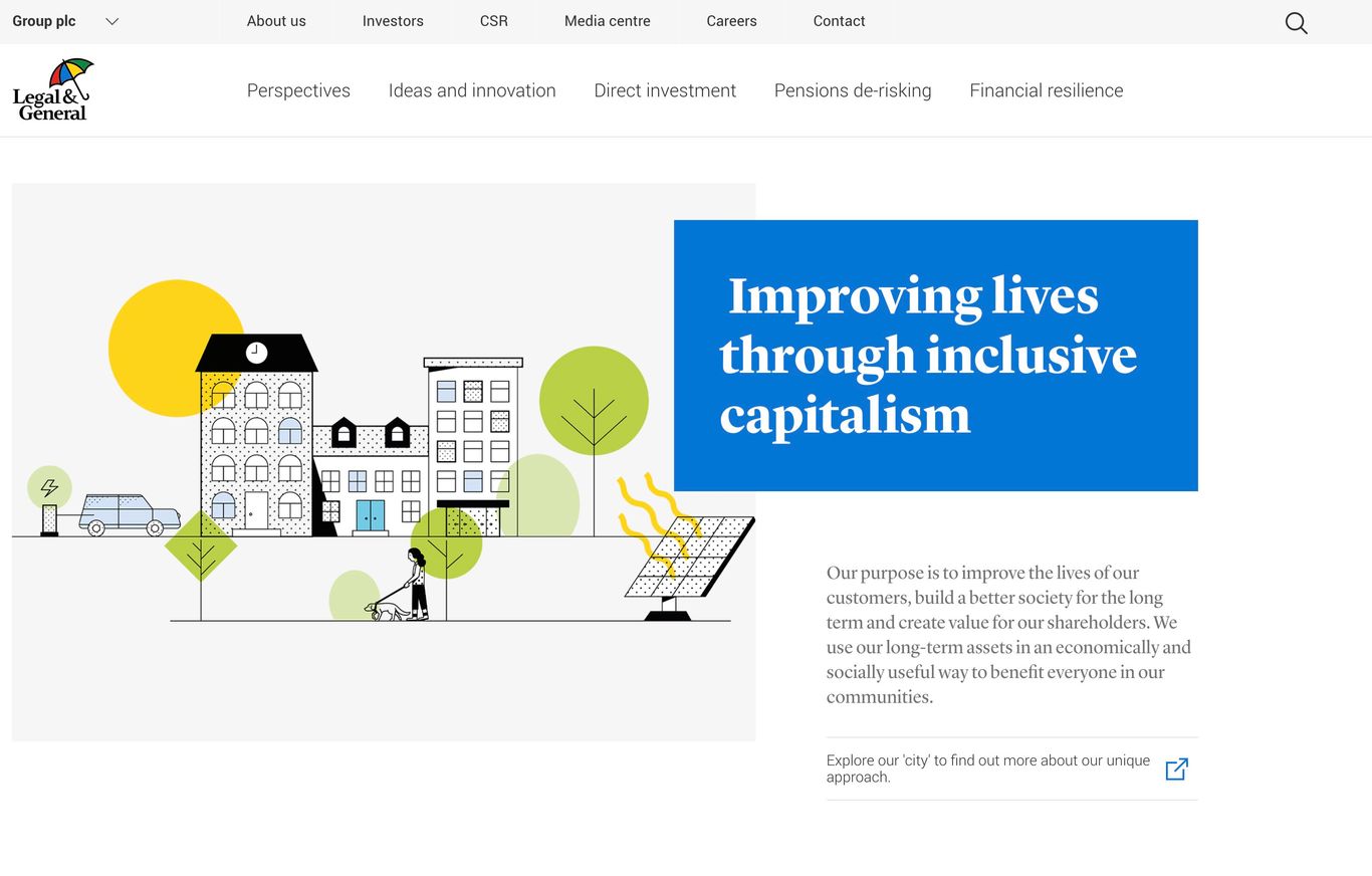
L&G show how they are “Improving lives through inclusive capitalism” by prioritising content they want to be know for in the main navigation.
Integrating video content and motion in the right way and showing and not always telling will be infinitely more captivating than words alone. The voices of your people are more authentic, relatable and possibly more believable that those at the top.
With the right inspiration creating content doesn’t have to be a chore either. We find that most employees will be sitting on great content and itching to tell their stories with genuine pride – some will be great writers or naturals on camera too. People and their personalities will bring life to your website, and often these stories are easy to connect with and demonstrate your purpose and strategy in action. If it's real, it's more memorable.
5. Keep the momentum up
Making an impression is one thing, falling in love may take a little longer. In other words, once you have your hard fought framework and some good looking stuff in place you'll need a solid plan with the people to feed the beast that you have created.
This is where the real work happens – 1% inspiration and 99% perspiration – and this is probably the part that puts most businesses off really going for it.
But, creating a system or framework doesn't have to be daunting or particularly hard to define. It's just got to be simple to grasp, work with your organisational culture and align with your internal channels.
How can we help?
We love to learn about new businesses, their challenges and meet new people, so please give us a call or get in touch to talk about making your communications more memorable.
We're always keen to hear what people think of our articles. If you'd like to know more or tell us what you think please get in touch also.